Hello everyone! At first, I wasn’t going to do a review of this pen, but rather body because I don’t have a complete pen, but then I thought “why not”, especially because I made 2 feeds that needed to be tested.
Всім привіт! Спочатку я не збирався робити огляд на цю ручку, тому що вона у мене не повна, а потім я подумав “чому би і ні”, тим паче що я зробив 2 фідера які треба було випробувати.
Sailor Professional Gear King of Pen ST Black w|custom Ski Slope ebonite feed and Architect BBB JoWo #6 ss nib (made in Japan/Germany/Ukraine)
Власно, за формою, ручка(KOP) нічим не відрізняється від своїх сестер Sailor ProGear і Sailor ProGear Slim, та має сигароподібну форму 1911 з обрізаними пласкими кінцями, але має великий розмір. Матеріал корпусу це смола чорного кольору яка світиться червоним на просвіт. Система заправки – картріджно-конвертерна, свого пропрієтарного формату Sailor. Ковпачок на різбленні, різблення 2-х західне, закриття\відкриття за 1 та 3/4 обертів.
Actually, in terms of shape, this pen(KOP) is no different from its sisters, the Sailor ProGear and Sailor ProGear Slim, and has a 1911 cigar-shaped form with cutting flat ends, but the bigger size. The material of the body is a black resin that glows red in the backlight. The filling system is cartridge-converter, of its proprietary Sailor format. Cap on thread, 2-start thread, closing/opening in 1 with 3/4 turns.

З прикрас ручка має родовану фурнітуру та стандартний для Sailor кліп притаманний моделям Sailor Profit. Широке кільце має надпис SAILOR JAPAN FOUNDED 1911, що відзначає дату створення компанії. Я не знаю навіщо, але на відміну від стандартних моделей, King of Pen має подовжену втулку, мабуть, для кращого утримання картриджів або конвертерів, у який зроблені прорізи, щоб можна було бачити кількість чорнила що залишилось. Така конструкція не додає жодних переваг окрім додаткової ваги, але дуже незручна при промивці пера за допомогою гумової груші. Як і у молодших моделей на секції є гумове кільце для кращого утримання корпусу. Але на відміну від Profit 1911 KOP у ProGear на наверші ковпачка є фірмовий логотип Sailor у формі якіру.
Of the decorations, the pen has rhodium-plated accents and standard Sailor clip typical lake in all Sailor Profit line. The wide ring has the inscription SAILOR THE KING OF PEN 1911, marking the company’s founding date. I don’t know why, but unlike the standard models, the King of Pen has an elongated sleeve, presumably to better hold the cartridges or converters, which has cutouts, so you can see how much ink is left. This design does not add any advantages besides the extra weight, but it is very inconvenient when washing the pen with a rubber bulb. Like as younger models, there is also have rubber O-ring on the section for better body holding. But unlike the Profit 1911 KOP, the ProGear has the Sailor logo as an anchor on the cap’s top.

Ковпачок має внутрішню пластикову втулку із різбленням до корпусу та внутрішній прихований ковпачок що запобігає висиханню пера.
The cap has an inner plastic sleeve with a thread to the barrel and internal hidden cap that prevents the nib drying.

Загальні розміри інструменту: довжина у складеному стані – 142 мм, зі знятим ковпачком – 123,6 мм. Діаметр корпусу – 15.3мм, в місці хвату – 12,7мм. Повна вага незаправленої ручки – 32,6 г (без картріджу чи конвертера), а зі знятим ковпачком – 18,75 г.
Overall dimensions of tool: folded length – 142 mm, without cap – 123,6 mm. Body diameter – 15,3 mm, at the grip – 12,7 mm. The weight of pen is 32.6 g (without installed cartridge or converter), and without cap – 18,75 g .

Хвилинки історії:
Чесно кажучи важко щось написати про історію цієї моделі яка має, можна сказати вже класичну форму. Про історію лінійки Profit/1911 я писав у пості Sailor Profit 21K (earlier version), але нагадаю що у 1981 році був створений 1911/Profit з використанням накопичених технологій і «ноу-хау» попередніх 70 років. Завдяки технології загартування металу наконечник пера мав делікатну гнучкість, забезпечуючи плавне письмо. Корпус ручки 1911/Profit мав чудовий баланс із пером і ідеально лягав на руку.
Стосовно моделей King of Pen, я не знайшов дати першого релізу, але припускаю що це сталось близько 2012-2013 року, не затримуючись після зміни дизайну до 100 річчю компанії. King of Pen це сама крупна ручка виробника, але цікаво що ProGear KOP, на відміну від 1911 KOP не випускається з ебоніту. Хоча є одне лімітоване видання The King of Pen “Naginata Togi Ebonite, Sekkei” (10-1810-328 -428 -628), яке зроблене з ебоніту та має обрізані навершя.
Moments of history:
To be honest, it is difficult to write something about the history of this model, which has, one might say, a classic form. I wrote about the history of the Profit/1911 line in the post about Sailor Profit 21K (earlier version), but let me remind you that in 1981 the 1911/Profit was created using the accumulated technology and “know how“ of the previous 70 years. With the metal-tempering technology, the pen nib had delicate flexibility providing smooth writing performance. The 1911/Profit pen body had a great balance with the nib, and perfectly fitted the hand.
Regarding the King of Pen models, I couldn’t find the date of the first release, but I’m guessing it was around 2012-2013, not long after the company’s 100th design change. King of Pen is the largest pen of the manufacturer, but it is interesting that the ProGear KOP, unlike the 1911 KOP, is not available in ebonite. Although there is one limited edition The King of Pen “Naginata Togi Ebonite, Sekkei” (10-1810-328 -428 -628), which is made of ebonite and has trimmed tops.

Головна задача була протестувати ще один варіант фідера, але я пригадав що досі не мав власного пера формату Architect(хоча багато їх зробив), тож вирішив саме для цієї ручки зробити максимально контрастний Architect.
The main task was to test another feed design, but I remembered that I still didn’t have own Architect nib (although I’ve made many of them), so I decided to make the maximum contrasting Architect nib to this pen.

Ширина лінії прямою стороною складає – 0,3 мм при вертикальному ведені та 0.9 мм при горизонтальному ведені, при нормальній подачі. Зворотна сторона пише із шириною лінії 0.4 мм.
The width of the line by right side has 0.3 mm in vertical direction and 0.9 mm in horizontal direction, with normal flow. The reverse side has 0.4 mm line width.

Що в підсумках: Я не прихильник формату Architect оскільки не вмію ним користуватись та не знаю файних шрифтів до правшів, але перо вийшло контрастним та гладким, а при збільшені кута нахилу навіть тонким. Тож нехай буде у колекції для порівняння та демонстрації прихильникам перового письма:)). До фідера жодних претензій, цей дизайн працює так само добре як і перший.
At the end: I’m not a fan of the Architect format because I don’t know how to use it and I don’t know any good-looking fonts for right-handed people, but the nib turned out to be contrasting and smooth, and even extra-fine with high hold angle. So let it be in the collection for comparison and demonstration to other fountain pen’s fans :)). No complaints about this feed too like a previous first one in 1911 KOP.

Update 1:
Як перше доповнення – фабричний продажний варіант. Коробка зовні виглядає як софттач, а всередині як текстиль.
As the first addon – a retail set. The outside of the box looks like a soft touch, and inside like a textile.


Update 2:
Перо до та після переточування.
This nib before grinding and after ground.

Update 3:
Сьогодні замість традиційно збільшеною фотографією пера фотографія з увагою на фідер та грінд.
Today, instead of the traditionally magnify photo of the nib, there will be attention to feed and grind.

Update 4:
Ось так ручка виглядає в руці. How this pen looks in my hand.

Update 5:
А ось порівняння із Sailor Profit 1911 KOP. На мій смак широке кільце ProGear KOP виглядає занадто вичурно, пробачте як циганщина.
And here is a comparison Sailor Profit 1911 KOP(above). For my taste, the wide ring on ProGear KOP looks “too much” in point of balanced design.

Update 6:
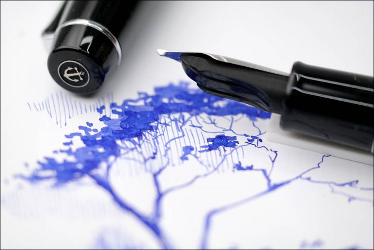
Наостанок ескіз – “Таков шлях” – японська тема до японської ручки.
At the end, a sketch – “This is the Way” – Japanese theme for Japanese pen.


Thanks for feedback!
1 Comments
Leave a Comment